AI-generated image
 Why Separating UI and UX is Sabotaging Your Website's Success
Why Separating UI and UX is Sabotaging Your Website's SuccessI've always believed that a great website should feel intuitive, like a natural conversation with your audience. This article nails it by pointing out a sneaky mistake many teams make: splitting user interface (UI) and user experience (UX) into silos. What looks sharp on the surface can trip up users if the navigation doesn't guide them smoothly, or vice versa. It's all one seamless journey for the visitor—they don't care about the labels; they just want it to make sense.
The piece dives into real-world examples, like a redesign where traffic was fine but conversions lagged because visuals didn't highlight key actions. By tweaking hierarchy, spacing, and subtle cues, the site suddenly clicked, boosting engagement without overhauling the structure. It's a reminder that visuals and flow must team up to reduce friction and build trust right from the first click.
This unified approach isn't just design theory; it directly impacts business results, turning your site from a static page into a dynamic tool that keeps users hooked and moving forward. If you're building or revamping your online presence, this insight could be the game-changer you've been missing.
Head over to the original article to explore the details and apply these fixes to your own projects.
This post has originally been written by Entrepreneur.com on Fri, Dec 26, 25. Find the original post here at Entrepreneur.com

Connie Harrell
Working with investors and entrepreneurs to gain the best ROI possible.
Related Posts

Uzbekistan's Next Chapter Will Be Written By En...
Uzbekistan’s next economic leap isn’t coming from infrastructure or policy — it’s being built by ...
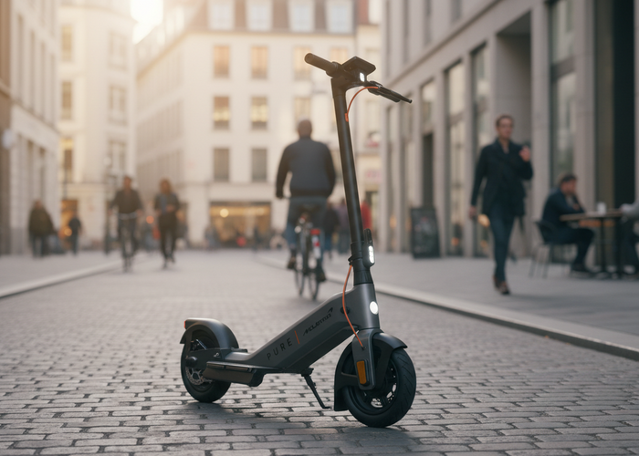
PURE Electric Completes Second Funding Round wi...
A follow-on investment in PURE Electric highlights how founder vision and strategic capital are r...

People Who Don’t Know How to Code Make 6 Figure...
AI has turned 'vibe coding' into a $4.7B opportunity—and you don’t need to write code to cash in.
Nearly 12,000 Businesses Faced the Same ‘Messy’...
One founder’s restaurant struggles led to a tech solution now used by over 12,000 operators to tr...

These Founders Are Building Healthcare Companie...
Two founders, one mission: redefining healthcare access for those the system overlooks.

Why Founders Need to Treat Credibility as a Gro...
Credibility isn’t fluff — it’s a growth accelerator. Here’s how smart founders build trust before...
0 comments